 kelvinA
So I was idly thinking about the potential name of the 8-in Printed Coaxial Hotend, and one thought that popped up was "I'm sure you could make a trendy and techy logo with a name like that.". I was intrigued, and after about 6 seconds solving the solution, I had this circular typeface idea and just had to see it IRL.
How I got to the logotype
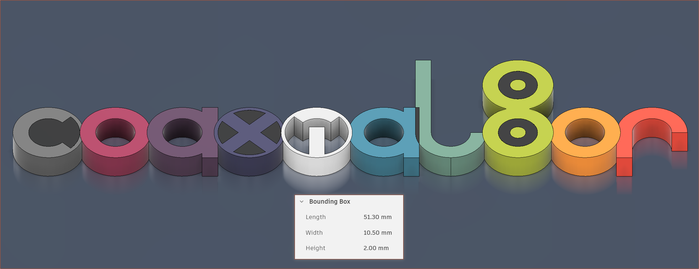
So I sketched my idea out in Fusion because I knew it was going to be one of those constraints-based logos. Extruded out the profiles and the negative space dismantled my initial idea:

That was simple enough to fix with a circular outline around everything. I also reduced the spacing so those outlines merged together. This also allowed me to have a negative space where the A and L intersected. Next, I experimented with the dots that I wanted in the design to convey the "coaxial" part. I tried 0 dots (didn't like it), A dot in each o-shaped part, dots in the last 4 characters (as I thought that the L and R could also signify how the inputs actually curve around the internal coaxialiser) and 8 dots (one for each input).
While the idea is nice, the dots just made the logo look excessively complex. I mean, yes, the internals of the actual hotend also look excessively complex so it ties in, but logotypes need to be easily legible.
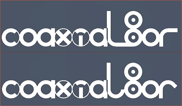
It also took a while to decide on the L and R design as the circle outlines weren't that legible. Notably, I tried 90 degree lines for both, or a 45 degree R bend before settling on the design at the top of this article:
Conclusion
Other than putting this logo on the empty space of the hotend cover, this logotype probably isn't going to do much. It's interesting that this project basically jumped the queue as I've been meaning to make #Tetrinsic [gd0041] and #SecSavr logos for months/years.
I might also make a CR600S in the same style (or find a circular typeface so I don't have to try modelling it).
Test Model Idea
[11:10] So, about an hour ago, I concluded that I wasn't going to do much with the logo. Only moments after publishing did I have the idea that I could have an 11-colour test model:
Think of it similar to a Mimaki or Stratasys demonstrator model:
I just chose some colours that I'd like to test out for the first couple of prints:
- I like dark greys
- I thought the i would look pure and internet-like if it was white
- the L is the milky-green I'm trying to obtain
- I thought having more muted colours for most of them and then vibrant colours for the last 3 characters was a nice idea.
- the purple is bq Aubergine and the dark blue is YouSu's Galaxy Blue.
- I thought an LED-matrix-inspired yellow-green 8 against black looked nice.
At first, I'm likely just going to be doing gradients between 2 colours.
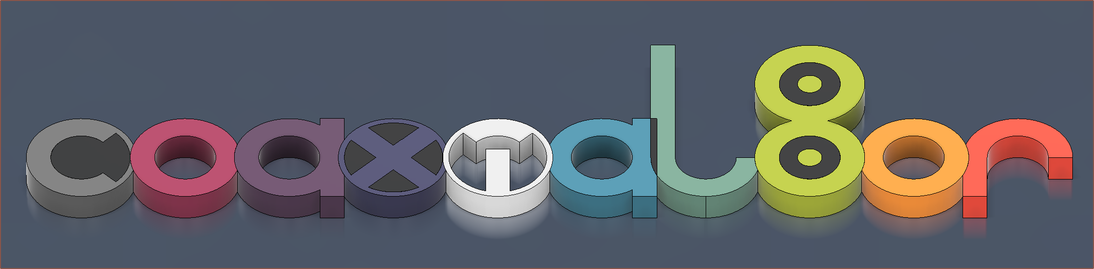
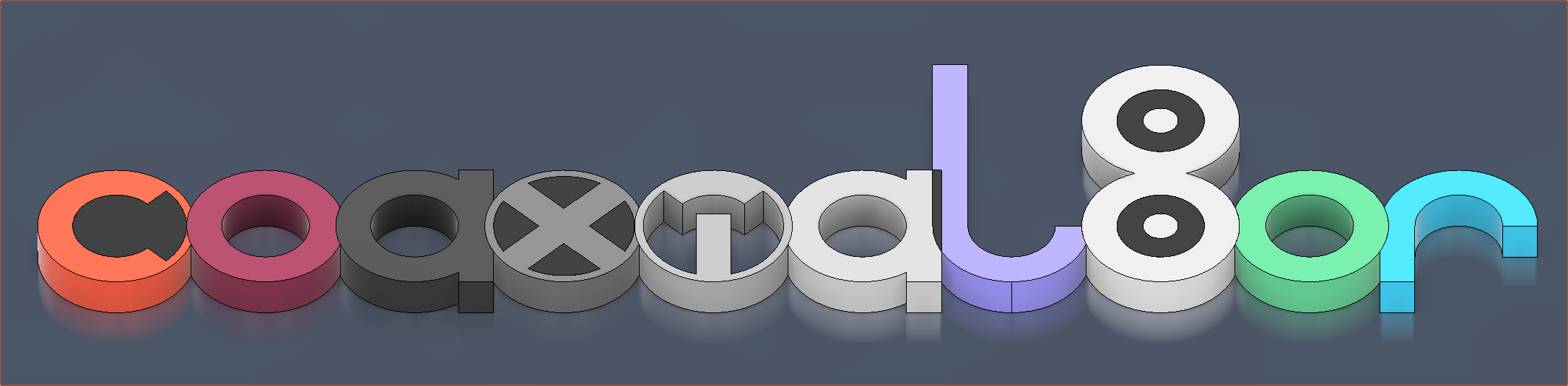
I guess for those that use American English, having "co" "l" "or" as coloured and everything else as greys is also an idea:
[12:00]
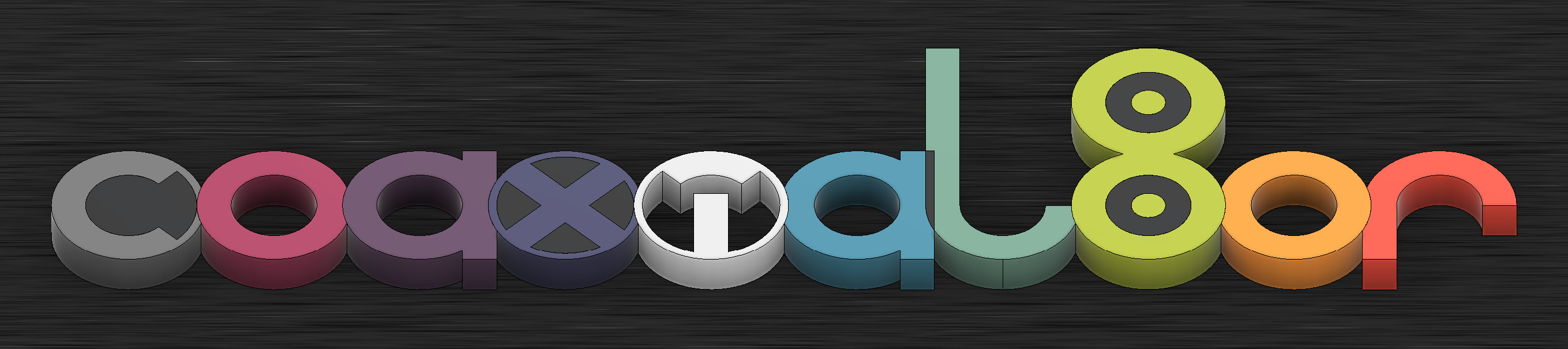
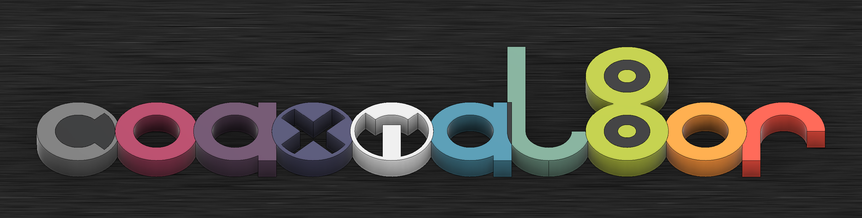
Just added a nice brushed, dark metal background:
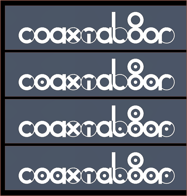
[13:30] I think an inverted X looks to have more depth (like the XBOX360 logo). This is 3D printing, after all.
Thus, the 2D now becomes:

[19:30] Haven't seen the logo for a few hours and thought that the dot of the ' i ' could be more legible instead of being in a superposition between ' i ' and ' T ':

In the test model, I've gone in and made the ' x ' a tad brighter and searched up the actual "bq Aubergine PLA" because the colour I chose looked slightly (but annoyingly) wrong. I feel that the tweaked colour is a lot closer to the true colour.
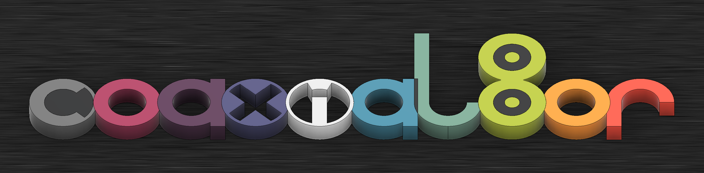
[21 Feb, 05:45] This modern and rounded logotype wouldn't be my first guess for a name as edgy/gamer as "Coaxial8or", but it seems to be rather fitting after giving it "six seconds" of thought, as I said yesterday.
Discussions
Become a Hackaday.io Member
Create an account to leave a comment. Already have an account? Log In.