 Stephen Holdaway
This project has existed in breadboard-form on my desk for 18 months. Though this is the first update in a while, it's a project I tinker on a lot: there's a menu system that's easy to work with, views can be pushed and popped, user input is transferred around automatically, and the event-loop is an interesting way to organise an embedded project. Problem is, none of these are core features. These things are polished not because they need to be, but because I've been putting off the harder task of making decisions about the in-flight views of the device.
Earlier in the project I'd sketched out a bunch of screens to see what might fit into in the limited screen resolution:
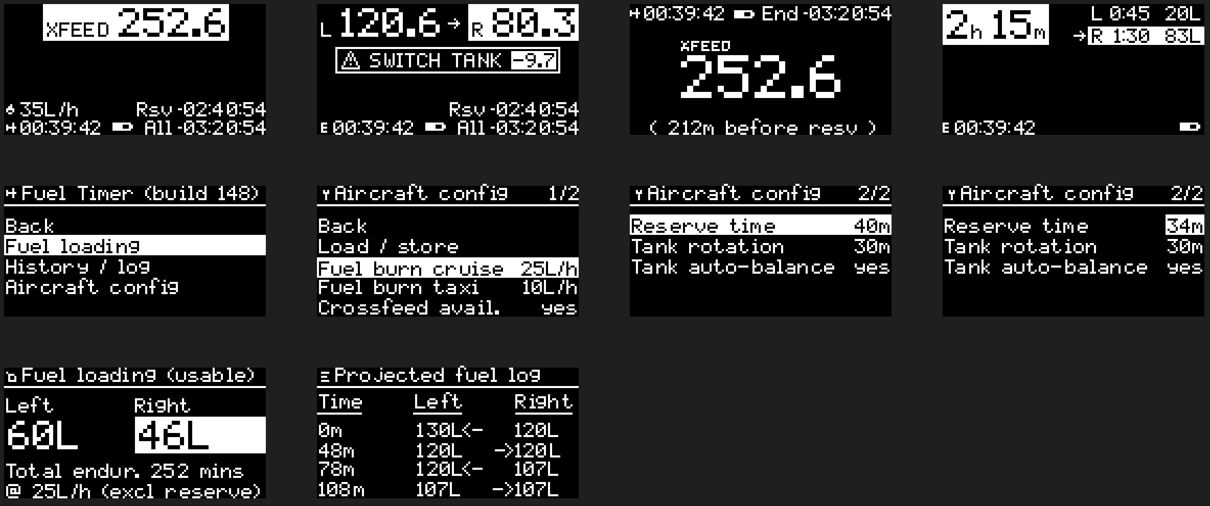
I wasn't too happy with the in-flight ideas (top row), particularly the "xfeed" ones where independent fuel tank timing isn't relevant and only a total value needs to be shown. The first few ideas all try to fit too much information on screen. Sure it all technically fits, but on a real screen, 3 small variations on the same number all cramped together in a small font aren't very easy to parse at a glance.
Menus on the other hand were dead simple (middle row above), and this is where I've put a lot of my tinkering time. There are a ton of examples of simple menu systems in existing products which are tried and tested - take any of Nokia's pre-Microsoft cellphones for example:
.")
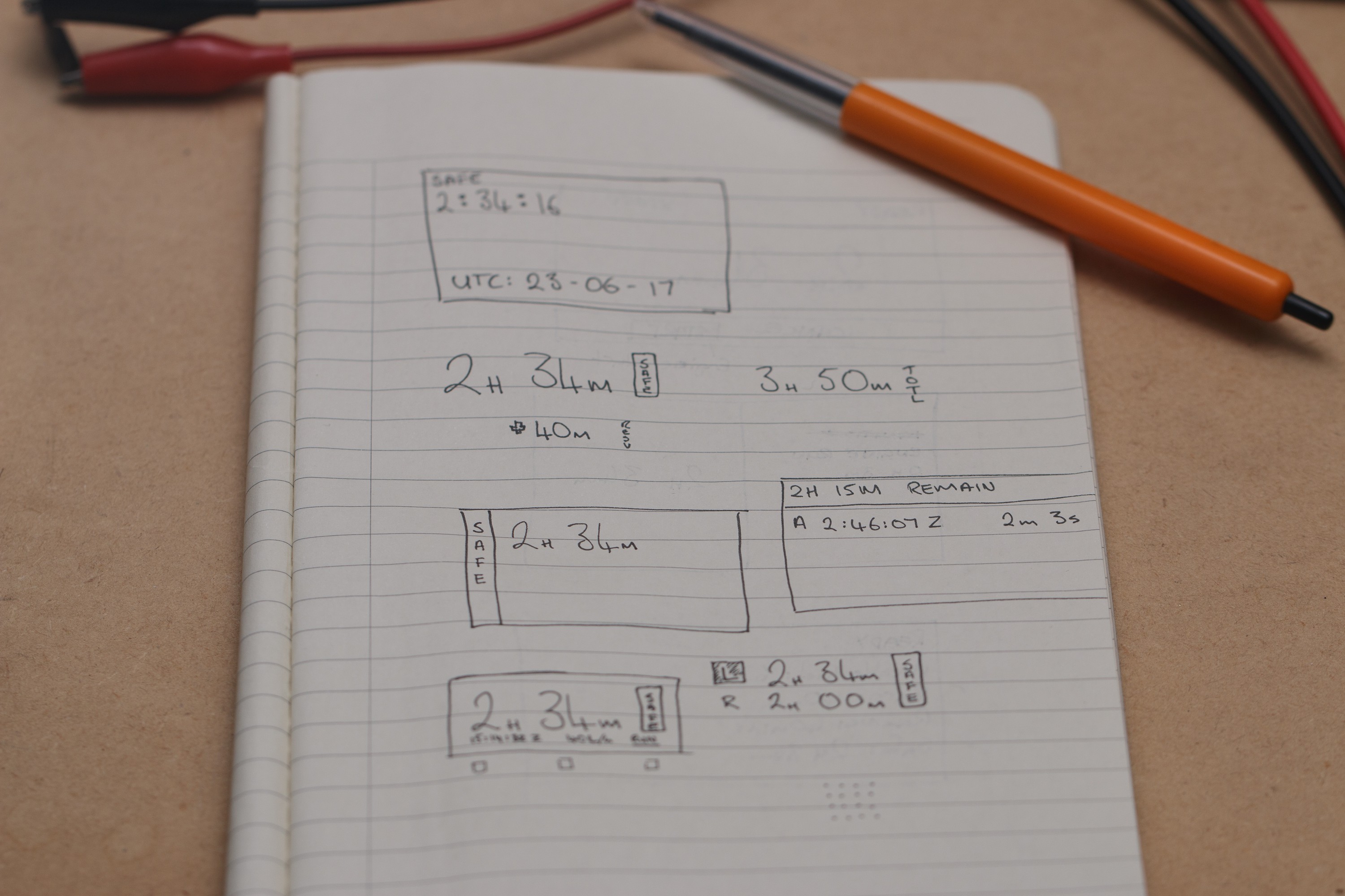
Recently I've gone back to pen and paper to design an in-flight view based on what information needs to be displayed, rather than how much I text can technically fit onto the display at once. The main piece of information is time remaining (this is just a souped-up countdown timer after all), so working with that I did some doodling:
Which turned into this mock-up at 128x64 (scaled up 10x here):

What also needs work is the hardware interface design, which up to this point has been a single rotary encoder. With recent time in the cockpit I've realised that the hardware interface for this project is pretty important.
In software land where I come from, it's pretty safe to assume that the user is looking at the screen, has the head-space to read messages, navigate the interface, and so on. In a cockpit environment, these assumptions are not going to be true most of the time. The interactions I expect to have with the device are during busy periods and need to be as predictable as possible: actions like starting and stopping the main timer essentially need to be done by feel with dedicated buttons rather than visually through the display.
I'm still working out what the hardware interface looks like, so more on that in a future post. I've been flying long routes as I work towards a commercial pilots licence, so I'm really looking forward to having this device in the cockpit soon.
Discussions
Become a Hackaday.io Member
Create an account to leave a comment. Already have an account? Log In.
Brilliant project, following.
I would love this if it had a few things built into the final iteration. A vibrating motor (vibrating reminder at preset tank change interval and when nearing minimums), a colour OLED (Would love to see flashing red bracketing and numbers when you blow a preset tank change of say 30 min when operating L/R).
Ideally when flying this could go into a shirt pocket or side of kneeboard so no matter how task loaded you are you can feel the reminders and alerts.
Please keep up the great work.
Are you sure? yes | no
As an aside, I've been struggling to find resources about designing UIs for small monochrome displays. There are lots of them out there (air conditioning control panels, some vaporizers, external camera flashes and the front screen on GoPros to name a few), but no-one seems to publish their thoughts, process, experience or ideas on what worked for them and what didn't.
Are you sure? yes | no
Since using LCDs I've been searching for that information. Like you I have found exactly nothing on the topic.
I guess you go the less is more route, with the standard approach of using similar items and such on every display.
What is important I think is less info on smaller displays. Readability always needs to be high and quick! Whitespace is important to divide information but isn't available too much on small displays...
Learning from how others did it seems the best way to learn.
Are you sure? yes | no